
Name Tattoo Ideas: 7 Lettering Directions
Ideas · July 16, 2026
A strong name tattoo is a lettering composition, not just a name typed in a decorative font. First lock the exact spelling, accents and capitalization. Then compare a direction such as signature, serif, sans serif, script, blackletter, initials or name-plus-date at the intended body shape. The name tattoo generator keeps the entered text exact while you test fonts, spacing and curve.
TL;DR
- •Freeze spelling, punctuation, accents and capitalization before styling.
- •Choose a lettering family for its shape and tone, not only its font name.
- •Use initials or a monogram when the full name is too long for the intended area.
- •Test spacing and baseline at real size on the body, not only on a flat screen.
- •Use a specialist or native reader for scripts and languages you do not personally read.
Seven directions for a name tattoo
| Direction | Visual character | Decision to test |
|---|---|---|
| Personal signature | Intimate and specific | Preserve authentic letter joins |
| Clean serif | Formal and literary | Keep thin serifs visible |
| Simple sans serif | Direct and modern | Tune spacing so it does not feel generic |
| Flowing script | Soft and connected | Open loops and avoid crowded flourishes |
| Blackletter | Dense and bold | Use enough scale for distinct letter shapes |
| Initials or monogram | Compact and discreet | Make the reading order unambiguous |
| Name plus date or symbol | Narrative and commemorative | Give the name a clear hierarchy |
1. Use a real signature when the handwriting matters
For a memorial or family name, the original handwriting may carry more meaning than a polished typeface. Start from the clearest available note, card or signature. Keep unusual joins and proportions that make it recognizable, but ask the artist to remove scanning noise and strengthen marks that disappear at the intended size.
2. Choose serif or sans serif for clarity
A serif direction can feel editorial, classical or formal; a sans-serif direction is quieter and more neutral. Compare uppercase, title case and lowercase because the silhouette changes. Do not judge by one attractive letter: preview the entire name, especially repeated letters and pairs such as AV, TT or rn that can create awkward spacing.
3. Give script and blackletter enough room
Script depends on loops, joins and rhythm. Blackletter depends on distinct counters and repeated vertical strokes. Both can become visually dense when compressed. Reduce decorative swashes before shrinking the name, and compare a straight baseline with a gentle curve that follows the intended body area.
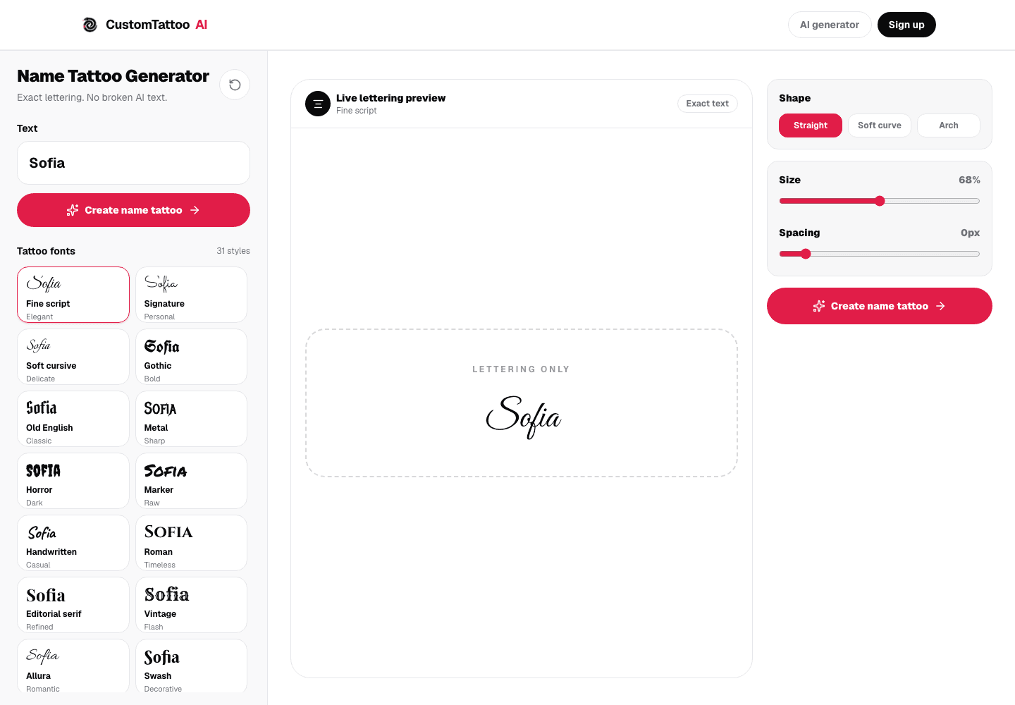
Name tattoo generator
Compare lettering without broken AI text
Enter the final spelling, then test font direction, spacing, size and baseline curve.
✨ Preview the exact nameExact text preview · Final lettering still belongs with the artist
4. Use initials when privacy or scale matters
Initials can preserve the reference without displaying a full name. Keep them separate for immediate reading, overlap them as a monogram, or place one inside a simple frame. Test both possible reading orders before choosing an interlocked mark. A monogram that only makes sense after explanation may need a simpler construction.
5. Pair the name with one supporting element
A date, small flower, line, star or symbol can add context, but it should not compete with the name. Decide whether the text or symbol is primary, then vary their scale accordingly. For a date, compare ordinary numerals with the Roman numeral tattoo ideas guide and verify the order before combining it with lettering.
Verify the text before styling it
Keep a plain-text master beside every preview. Check spelling, accents, apostrophes, hyphens, capitalization and date independently. If the name uses a script or language you do not read, have a fluent native reader confirm the exact characters and direction before the stencil. Generative image models can distort text, which is why the name tool renders the entered characters directly rather than asking an image model to spell them.
| Proof step | Question |
|---|---|
| Plain text | Is every character exactly correct? |
| Lettering preview | Can each letter still be identified? |
| Real size | Do loops, counters and spaces remain open? |
| Body placement | Does the baseline follow the body naturally? |
| Stencil | Is the orientation correct and unchanged? |
Useful next guides
Roman Numeral Tattoo Ideas
Add a verified date without confusing day and month.
Tattoo Size Guide
Check whether the chosen letters have enough physical room.
Tattoo Stencil Guide
Protect spelling and orientation during artist handoff.
What font is best for a name tattoo?+
There is no single best font. Choose a lettering family that keeps every character readable at the intended size and suits the meaning, then let a lettering artist adapt it to the body.
Can I use someone's real handwriting?+
Yes. Start from the clearest authentic sample and ask the artist to preserve identifying forms while cleaning noise and weak marks.
Why use an exact text generator instead of an AI image generator?+
An exact text preview preserves the characters you enter. Image models can alter spelling, so they are better used around the lettering than as the authority for the text itself.
Sources
- CustomTattoo AI: exact name tattoo generator · checked July 16, 2026
- Monolith Studio: custom lettering, spacing, curvature and script verification · checked July 16, 2026
- Tattooed.co: fonts as references adapted by a lettering artist · checked July 16, 2026
Keep reading
Roman Numeral Tattoo Ideas: Dates Without Errors
Choose a Roman numeral date layout, order, separator, lettering style and accent, then verify every number before approving the stencil.
Tattoo Size Guide: Match Detail to Real Scale
Choose a tattoo size by subject, detail, body area and composition, then prepare dimensions your artist can evaluate at real scale.
Tattoo Stencil Guide: Lines, Mirror and Print Size
Understand what belongs in a tattoo stencil, how line choices differ from shading, when to mirror and how to prepare a real-size artist handoff.